
Cut
The default for recognition, utility and reproduction. Use Cut when the mark needs to work quickly, quietly or at a small size.
Download Cut SVGNeutral surroundings. Natural colour.
A precise response to attention.

Direct in expression.
Alive in the details.
Fyronyx brings science, technology, research and operating capability to consequential problems. The aim is useful outcomes, environmental and social good, and durable wealth.
Start with
what matters.
Build what helps.
A place for rigorous questions, selective experiments and work that can become useful products, systems and ventures. Technology serves the outcome. The outcome gives the work its value.
Speak about what is being investigated, built or operated. Describe intended effects as intentions until evidence supports a result.
Positioning & boundariesBegin with the people affected, the condition that needs to change and a question worth testing.
Make the method, evidence and uncertainty understandable. Let the reader see why a decision follows.
Connect the useful outcome to its economics, ownership and wider effects. Ambition needs a credible path.
Cut is the clear, everyday signature. Facet brings depth to larger brand moments. They share one Balance silhouette, one name and one set of proportions.
The default for recognition, utility and reproduction. Use Cut when the mark needs to work quickly, quietly or at a small size.
Download Cut SVG
The richer expression for a cover, opening or campaign. Use Facet where there is enough scale and space to appreciate its planes.
Download Facet SVGAn optional flight study for digital openings. A brief light pass crosses the feather planes while soft blue wind trails travel right. The resting mark stays exactly as supplied.
The static mark is shown. Replay the optional flight study.
| Context | Expression | Use |
|---|---|---|
| Headers, navigation and glass islands | Cut | Compact identity paired with the Fyronyx name. Keep the mark single-colour and visually quiet. |
| Favicons, app icons, avatars and email signatures | Cut | Preserve the clear silhouette. Reverse it to frost on a dark field; do not miniaturize Facet. |
| Proposals, reports and everyday stationery | Cut by default | Use in headers, footers and interior pages. A large tonal cover may use Facet; the interior returns to Cut. |
| Website openings, presentation titles and launch imagery | Facet | Give one large mark a quiet dark field. Keep functional headers and navigation in Cut. |
| Film, motion and large digital displays | Facet | Light may move across the fixed planes; the silhouette stays stable. Respect reduced motion and preserve a static fallback. |
| Embossing, engraving, foil, stamps or one-ink printing | Cut | Use the single-colour master and proof the material, process and physical size. Do not approximate facets with fragile lines. |
Cut: 24px or larger for routine placement; 16px is reserved for constrained favicons. Facet: start at 128px canvas width. Below that, use Cut. Physical sizes require a process-specific proof.
Use Ink Cut on light fields and Frost Cut on dark fields. Current Blue Cut is an optional purposeful accent. Facet uses the same Current Blue plane family, with a light-ground variant for Frost and Paper. Keep both away from busy imagery.
Preserve the supplied square canvas and aspect ratio. Keep a clear zone around the visible silhouette of at least one quarter of its visible height. Apply the same rule to both expressions.
Use the same wordmark and optical alignment. Never mirror, stretch, crop, add an eye, redraw a facet or attach a star. Neither expression identifies a different company, product tier, AI state or approval status.
Both expressions can appear on one page: Cut in the functional header, Facet in one prominent brand moment. Do not repeat Facet across controls or place Cut and Facet side by side as if they were separate partner logos. The comparison here explains the system.
Jeremy selected Balance and endorsed Cut and Facet together for the guidelines. These files define that family. This brand page uses Balance Cut in functional branding and presents Facet as its expressive counterpart. Other products require their own rollout; this edition adds derived outlined wordmark and lockup files below.
The company name uses Geist. These outlined wordmark and horizontal lockup exports carry the same letterforms without a font dependency. Use the supplied arrangement as a whole.
The guide surrounds the visible silhouette by one quarter of its height. Preserve the SVG canvas as well.
Cut at actual CSS sizes. Prefer 24px and above; 16px is constrained favicon use. Facet starts at 128px. Review the actual device or production process.
Keep the proportions.
Keep the orientation.
Keep the whole silhouette.
Do not add an eye, star, outline, glow or new facets. Do not place Facet inside controls. Use the wordmark only as the company name; it does not replace clear labels in an interface.
Cool off-white neutrals make the space. Natural subjects bring colour. Current Blue connects recognition with the next clear action.
Current Blue #245F9E is the accent and the optional blue identity expression. Ink is the everyday Cut signature. Neutral buttons and neutral selection are equally part of the system. The retained palette is unchanged; these application aliases replace the compulsory blue environment.
Water, rock, tools and real work can bring their own natural tones. RGB separation is an optical response at the glass edge, not a new palette for badges, data categories or status. No permanent rainbow borders.
Make the
next step
clear.
Ink / paper
16.12:1Light ink / charcoal
15.28:1White / Current Blue
6.56:1Calculated contrast for these opaque sRGB pairs. Check the actual composite again over imagery, glass and hover states.
| Role | Web starting point | Use |
|---|---|---|
| Display / Geist 400 | 48–80px; 38–52px narrow | Short covers and openings. Never compress a long headline to fit. |
| Product title / Geist 500 | 30–40px / 1.15 | Task hierarchy before campaign scale. |
| Section / Geist 500 | 24px / 1.25 | A clear step in the argument. |
| Reading / Geist 400 | 16px / 1.65 | 65–72ch measure; short paragraphs with a useful rhythm. |
| Dense record / Geist 400 | 14–15px / at least 1.5 | Evidence remains readable; wrap rather than hide it. |
| Metadata / Geist 400 | 12px / 1.55 | Versions, dates, figures and occasional labels. |
| Action / Geist 500 | 14px / 1.4 | 44px target; 16px editable input text on mobile. |
Clear enough to act on. Attentive enough to notice the detail. Precise enough to separate a possibility from a result.
We turn consequential questions into work worth building.
Name the problem, the method and the outcome sought. Keep the ambition concrete.
Unlocking revolutionary AI-powered transformation.
A source is missing.
Add the referenced record.
Say what is true, what it means and what the person can do next. A brief explanation beats a warning badge.
Oops! Something went wrong with your AI workflow.
The sample suggests a shorter handoff. A wider test is still needed.
State the observation before the inference. Include the sample, period, method and limitation when they matter.
Proven to transform productivity for every team.
One idea per headline. Sentence case. Concrete nouns and active verbs. Use “you” for instructions and invitations; “Fyronyx” or “we” for company intent. Avoid inflated adjectives, forced urgency and decorative technical language.
Openings can be expansive. Reports are measured. Product copy is direct. Errors are calm and useful. Tone changes with the task; precision and respect remain constant.
Link a source beside the claim it supports. Separate a forecast from a result and a generated example from real work. Never invent a customer, affiliation, metric or environmental benefit.
A label earns its place by helping someone find or interpret information. Avoid repeating the heading in an eyebrow, status badge and notice. Use Geist for versions, dates and useful figures, with tabular numerals where alignment helps. Avoid decorative eyebrows and monospace presentation.
One dominant idea, a clear reading area and enough space to understand the subject. Repeat alignment and proportion across formats; adapt the scale to the job.
One argument.
Enough room to understand it.
Lead with one subject and one useful idea. A quiet natural photograph may establish the setting; an image-free editorial opening is equally valid. Use deliberate negative space, restrained saturation and a clear title. Ocean is an example, never a required motif. The crystal remains an optional supporting asset, not the default hero.
Use neutral opaque surfaces, alignment and restrained rules. Bound prose to 65–72 characters. Let diagrams, evidence and dense work take the space they need. Do not turn every item into a glass card.
8px within related details, 16px between groups, 24px between independent blocks. Increase section space deliberately. Keep one owner for each gap. Compact controls use a 6px inner inset without shrinking their hit areas.
| Format | Frame & inset | Hierarchy |
|---|---|---|
| Web | Up to 1440px; 28px desktop / 16px narrow gutters | A bounded reading measure inside a flexible frame; no horizontal page scroll. |
| Report | Responsive digital reading; A4 is an export adapter | Start at 16px with a bounded reading measure. Charts and tables reflow or provide a readable alternative; sources stay close. |
| Presentation | 16:9; at least 64px safe inset at 1920 × 1080 | One argument per slide. Natural subject matter or an image-free neutral opening may accompany Cut; evidence pages stay clear. |
| Social | 1080 × 1350 or 1080 × 1080; 8% safe inset | One short headline, one visual idea. Move detail and caveats into the caption. |
Choose images for their subject, not their ability to fill a rectangle. Materials, landscapes, work and honest diagrams connect the identity to real things.

Show relevant materials, tools, prototypes, processes, places or people doing actual work. One clear subject is enough. Avoid generic robot imagery, stock handshakes, abstract crystal heroes and macro textures used only as wallpaper.
Prefer natural or credible directional light, visible texture and neutral whites. Preserve the subject’s own colour. Do not impose a teal wash, crush shadows, remove material detail or make every photograph icy blue to match the interface.
Show context, then the subject, then a useful detail. Leave a genuinely quiet area when text shares the frame. Check landscape and portrait crops; keep faces, hands, instruments and defining relationships intact. If a crop fails, use a different frame.
Use owned or appropriately licensed work photography for documentary claims. Record source, owner, rights, credit and consent where applicable. Label generated imagery as illustration or concept near its first use. A convincing image is not proof of a team, facility, result or partnership.
Crop to preserve the subject; do not distort it. A restrained neutral or dark wash may create a quiet reading area, but do not colour-code documentary evidence or alter what an image proves. Captions belong beside the image. Decorative imagery uses empty alt text; meaningful imagery describes the relevant subject.
Before use, record source, owner, rights, required credit, channels, consent where applicable and any expiry. Verify a photograph separately from any claim made about it. The alpine image is supplied under the Unsplash license; its source link is retained beside the background example and in the kit.
Film keeps its natural pace. Avoid rapid cuts, flashing or aggressive loops. Use a readable wash, a static poster and adjacent pause. Ambient motion stays subordinate to the subject; avoid glowing controls, idle rainbow animation and ornamental particles. Dense work sits on a stable opaque reading surface.
Glass gives navigation a lighter presence. A compact island opens into useful context. Content stays clear, stable and within reach.
Try the refractive buttons, action menu, working panel and workspace drawer. Their surfaces and content move together; labels stay sharp. A focused field uses one fine edge. Cursor light stays soft; the rim carries the refraction.
Interactive material study with generated ocean imagery. Nothing is sent or stored outside this preview. Open the full material workspace.
What would make this workflow clearer for the people who use it?
Observe the handoff. Compare the available sources. Name the uncertainty before choosing the next step.
Illustrative working note. No external research or model request is running.
The next decision is whether the proposed approach answers the original question.
Apple-informed web materials. This is not a native Liquid Glass renderer.
One question. A visible next step.
Stable surfaces, a clear hierarchy and room for the work. Glass carries navigation and contextual controls. Persistent reading stays stable.
One clear next step. Useful feedback. Familiar controls that stay available on touch and keyboard.
Interruptible transitions explain change. Light and refraction respond to the control being used; the surrounding content stays steady.
A quiet resting material becomes more expressive when you interact. One compact glass group; crisp labels above the optics.
| State | Material response | Keep clear |
|---|---|---|
| Rest | Faint thickness, soft rim, minimal colour separation. | Stable content and visible selection. |
| Hover / keyboard focus | Local lens, moving rim light and noticeable RGB splitting. | Focus outline and labels are never refracted. |
| Press | Stronger local bending and dispersion; restrained compression. | Touch and keyboard activate the same action. |
| Selection / release | A brief stretch during spring travel; settle promptly. | State changes immediately; interrupted transitions clean up. Keep the glass through the exit, then release its renderer. |
| Reduced effects / unavailable optics | Immediate state changes, CSS frost or an opaque fallback. | Every destination remains usable without the shader. |
6px menu inset
52 / 46px desktop / narrow control height
44px minimum target
One material owner per group
Use concentric corners: inner radius equals outer radius minus inset and border. Natural texture is sampled only inside the known-image reference; this web model does not refract arbitrary page content or reproduce native Apple Liquid Glass.
Try the optical referenceUse the packaged renderer and its state tuning, rather than recreating the effect from a screenshot. Compare Glass depth and Prismatic edges. Long reading, records and dense charts retain stable reading surfaces. Menus, context panels and drawers may use the frosted material.
The UI library brings these principles into actions, forms, navigation, data and motion.
A company identity should feel familiar in a proposal, a website and the tools people use every day. The scale changes. The discipline stays.
A considered approach to
one important handoff.
A useful proposal starts with the actual question, the available evidence and a clear boundary.
The adopted mark. Quiet type.
Natural colour. A precise material response.
Application and copy specimens. These do not represent an available service or a live customer engagement.
Digital reports and presentations are the primary formats. Open the digital report Open the presentation
Carry the same proportions, colour roles and type into reports, presentations, social posts and personal correspondence. Make each format do its own job.
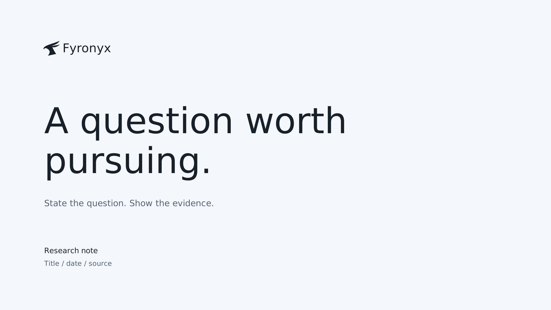
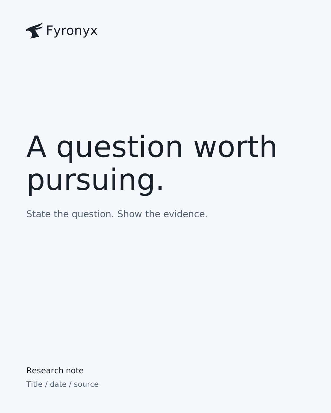
Lead with the question. Use responsive charts with inspectable values, visible uncertainty and sources beside the argument. Keep report navigation and reading comfortable on screen. PDF is a secondary export. Name the scope, method, owner, exclusions and next decision. Use sources beside claims. A finished review is not approval to issue a proposal or implement its recommendation.
Give each page one argument. Use a source, period, units and caveat with a chart. On social, put enough context in the caption to prevent a cover line becoming an unsupported claim. Company and personal authorship remain distinct.
Keep the email signature compact, in live text and system type for resilience. A name, role and verified contact route are enough. Do not add badges, invented certifications, empty social icons or a slogan to every message.
A compact set of masters and editable starting points. Download the complete kit or take the file you need. Preserve the silhouette, font licenses and source notes.
One portable system for websites, apps, charts and documents. Includes neutral tokens, compact control primitives, AI interpretation rules, runnable evaluations and the working optical reference.
Application system 2.2.0. Extract the archive for the complete guides, assets, examples and Python evaluations. This is a major application-default change; existing products migrate only within their own authorized work. Review digital examples at their actual viewport and input modes; PDF exports need their own proof.
Cut, Reverse and Facet. Outlined wordmarks and lockups. Colour roles, licensed Geist, seven neutral editable templates, material and interaction rules, optional supporting artwork, and the offline book.
Use SVG for identity and vector artwork. Keep viewBox proportions and meaningful names. Supply sRGB raster exports at the target dimensions; inspect both the delivered file and the final context. Keep icon artwork clear at small sizes rather than substituting Facet.
Screen hex values are the colour authority. Agree stock, profile, ink process, bleed and finishing with the printer. Obtain a stock-specific colour conversion and a physical proof; no universal CMYK or Pantone equivalence is claimed. Templates are RGB starting points, not press-certified artwork.
SVG artwork remains editable and embeds the licensed fonts. Report and presentation templates are standalone HTML with print styles and a Print / save PDF action. They are not native Office files. Replace instructional fields, add the source details and review the resulting export before use.
Edition 04.2 carries the accepted neutral material direction into the guidelines; new applications still need their own rendered review. Publication of this book does not approve an offer, customer claim or migration of another product.
The principles, construction rules and source decisions behind the expression. Open the detail you need.
Edition 04.2 adopts the neutral material direction: cool off-white and charcoal surroundings, natural colour, compact glass and dynamic refraction. Balance and the retained palette remain preserved; unrelated products migrate through their own authorized rollout.
Fyronyx is direct, attentive and exact. The current expression is neutral and material-led: quiet typography, natural subjects and compact functional glass. Ordinary surfaces recede so useful content can lead. A control responds to attention without making the whole page perform.
Jeremy accepted the ocean-glass direction and requested adoption into the guidelines on 9 November 2026. This evolves Fieldwork without changing company purpose, Balance identity or licensed type. It does not authorize a public release or migrate another product.
Fyronyx exists to solve consequential problems and deliver outcomes people and organizations value. Science, technology, research and operating capability serve that purpose. Environmental and social good and durable wealth are aims, not claimed results.
| Expression | Naming and identity | Use |
|---|---|---|
| Company | Fyronyx | Owns the shared visual and verbal standard. |
| Service | Fyronyx + descriptive service name | A name such as Workflow review describes a proposed offer; it is not an approved commercial scope. |
| Product | Approved product name + by Fyronyx | Use only after naming and ownership approval. Workspace is a synthetic specimen here. |
| Venture | Separately approved endorsement | Do not imply a portfolio relationship through visual similarity. |
| Lionmark | Separate identity | No absorption, renaming or shared authority is implied. |
Use the company name in title case. Fieldwork names this visual direction internally; it is not a new business, product or public service name.
Write in plain language with concrete nouns and active verbs. One idea per headline; sentence case throughout. Keep public headlines near fourteen words or fewer. Use institutional language for company claims and direct instructions for controls.
| Context | Use | Avoid |
|---|---|---|
| Website | Choose one workflow to understand. | Unlock autonomous transformation. |
| Proposal | Agree the sample, review owner and completion criteria. | Guaranteed savings without a baseline. |
| Product | Held. A source is missing. Add the referenced record. | Your AI workforce has handled it. |
| Evidence | Synthetic example. Review has not been authorized. | A simulated success presented as a customer result. |
Use “checked” only when the relevant check has occurred and its scope is clear. A review can finish without authorizing implementation or sending. Avoid invented metrics, implied partnerships, superlatives, exclamation marks and generic AI slogans.
Use cool off-white or charcoal surroundings, a clear reading area and one deliberate subject. Natural colour belongs to the image or the work. Image-free layouts can express the same brand through type, proportion and restraint.
The retained palette file is immutable. The current additive application layer supplies cool off-white #F4F7FB, opaque paper #FCFDFE, ink #18202A, secondary ink #536171 and line #D5DEE8. Dark applications use charcoal #18202A, surface #222d38, ink #F4F7FB, secondary #BDCAD8 and line #414F5F.
Current Blue #245F9E is the current blue expression and action accent. Ink is the everyday signature, with #1c4d82 for hover/text and #8ABBE8 on dark surfaces. Do not cover an ordinary interface in brand blue. Neutral primary buttons and selected controls are valid. Signal colours require actual state and text. Current Blue is not a new full-page colour field; keep ordinary surfaces off-white and blue-grey.
RGB dispersion is an optical exception, not a new semantic palette. Verify text and state contrast on the actual composite. Normal web text needs 4.5:1; applicable essential control/state boundaries need 3:1. Print requires a stock-specific proof, not a universal CMYK claim.
Geist 400 carries display and reading; 500 supplies restrained emphasis. Use 600 only where denser hierarchy benefits. Dates, figures and references use the same Geist family. Sentence case, concrete nouns and readable measures carry the voice.
| Role | Web starting point | Use |
|---|---|---|
| Editorial display | 48–80px; 38–52px narrow / 1.08–1.12 | Geist 400; a short opening, not a universal scale. |
| Product title / section | 30–40px / 24px | Geist 500; task hierarchy first. |
| Reading | 16px / 1.65; 65–72ch | Geist 400; dense records may use 14–15px. |
| Metadata | 12px / 1.55 | Geist with tabular figures where useful. |
| Controls | 14–16px; inputs 16px | Do not shrink text or hit areas to rescue layout. |
Use a flexible frame up to 1440px, 28px desktop and 16px narrow gutters, and a bounded reading measure. Collapse contextual rails above the content on small screens. Ordinary opaque panels may use 16px desktop / 12px narrow corners.
Keep 8px within related details, 16px between groups and 24px between independent blocks. Give editorial openings deliberate breathing room without importing those gaps into dense tools.
Glass groups use a 6px inset, concentric corners and 52px desktop / 46px narrow controls. Maintain at least 44px targets. Reduce redundant controls or reflow before reducing labels. Capsules belong to functional controls, not every card.
Print starts on white or opaque paper: A4 with 18mm margins and 10.5–11pt reading type. Slides use a 16:9 frame and a clear safe area. Native points, web pixels and print units remain distinct.
The selected Balance family has two expressions: Cut for core identity and Facet for larger brand moments. Jeremy endorsed both for the guidelines after the shared-contour geometry pass. The identity chapter defines their use, size, background and clear-space rules. Reverse is a colour variant of Cut. The brand page now uses the selected Balance Cut. The earlier bird head from PR #49 and full phoenix/north-star assets are retained as historical sources; unrelated products have not been migrated.
 Fyronyx
A shared identity does not mean copying the homepage everywhere. Every example is illustrative, not evidence of a service or delivered engagement.
| Surface | Keep | Adapt |
|---|---|---|
| Website | Neutral frame, quiet type, relevant subject | One useful invitation; compact glass navigation where it helps. |
| Working app | Neutral opaque workspace, Balance signature | Task density and real states; optional functional glass, no ocean requirement. |
| Report / print | White or pale paper, dark ink, disciplined rules | Restrained identity blue; no live refraction or rainbow ornament. |
| Slides / social | One subject, one title, identity and margins | Material can support an opening; avoid repeating it behind every argument. |
| Native Apple app | Fyronyx identity and information hierarchy | Supported system materials and platform behaviours, not browser shader constants. |
Prefer approved work artifacts, useful diagrams, honest materials and people doing real work. A diagram must explain a relationship. Keep labels legible and supply a text equivalent.
Use Phosphor Regular as one clean, single-colour icon family. Keep optical size and stroke consistent, with 20px artwork in a 44px or larger target. Add an icon only when it clarifies an action. Do not repeat arrows beside every link, mix emoji and symbols, or use the identity mark as an action icon. The identity mark is not a UI icon. Labels, selection and keyboard focus remain crisp above the optical layer.
Default, hover/focus, pressed, selected, disabled, pending, empty, failure and recovery each have a truthful visible state. Refraction never substitutes for a label, selection cue or actual feedback. Essential actions work without hover.
The packaged optical reference specifies the motion and lens tuning. Selection may stretch briefly while travelling; release settles promptly. View changes are interruptible and outgoing content stops taking focus. Reduced motion removes springs, drift and animated transitions. Solid mode removes transparency and optics. Unsupported WebGL uses CSS frost; unsupported backdrop filtering uses an opaque surface.
| State | Example | Boundary |
|---|---|---|
| Loading | Opening the source. | Only during a real pending read. |
| Empty | No sources yet. Add the material to review. | Only after the initial read completes. |
| Held | A source is missing. Add the referenced record. | Name the next owner and unresolved condition. |
| Error | The source could not open. Try again. | Offer retry only where it works; preserve the draft. |
| Review required | A draft is ready to check. Open the cited sources. | No implied approval to issue or implement. |
| Complete | The review is recorded. | Name version and reviewer; review completion is not release approval. |
The canonical source is docs/brand/fyronyx-brand-book.html. Page composition lives in styles/context.css. Retained palette files remain immutable. The self-contained companion is generated from this book; edit the source, then regenerate it.
Jeremy owns final brand direction. His 9 November 2026 instruction adopts the accepted neutral material direction into these guidelines. This source update does not publish the book, replace a live site, migrate an existing product or install a shared skill.
Keep decisions, sources and proof separate. Canonical prose, portable rules, implementation examples and generated exports must agree. Record exceptions against the medium and verify the rendered result. Historical overlays and earlier editions remain provenance; they do not restore blue-environment or mandatory-crystal defaults.





An artifact before a claim.
Build each article, short post or slide around one useful operating question. Lead with the work, give enough evidence to assess it, separate interpretation, then name a bounded implication.